PANTONE® Colors Adds Minion Yellow
 Designers and graphic artists needed a tool that could be used universally to ensure consistent color selection every time. Enter Pantone. In 1963, Pantone established the Pantone Matching system or simply PMS system. Today, Pantone is the main reference tool for all industries when they work to match colors and forecasted hues. The PMS system uses a standardized Pantone numbering system to identify each color (for example: Pantone Red 199), making it easy for anyone to refer to a specific color. If you’re looking to add color to your home, work with Blinds & Designs serving San Francisco. We’ll be happy to help you match the specific Pantone color you want.
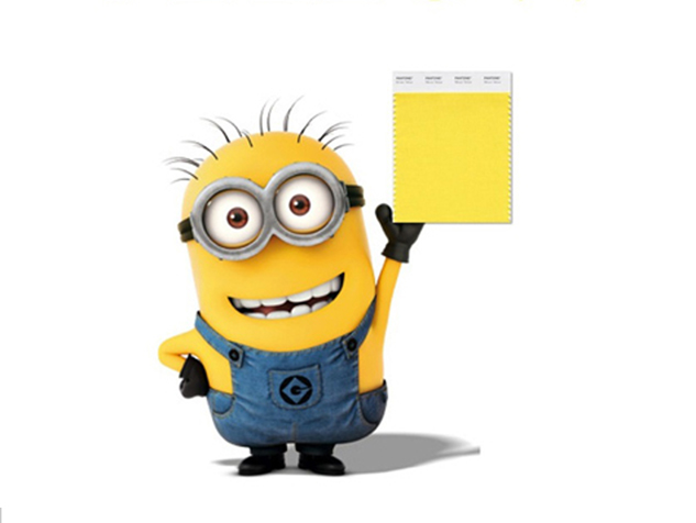
Inspired by Entertainment’s Minions
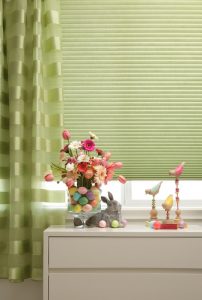
For the first time ever, Pantone color system uses character-branded Minions from Universal Pictures and Illumination Entertainment’s Despicable Me franchise, using their playful yellow to coin “Minion” Yellow. Just as the sun’s rays lift our spirits and mood, so does the forecast color of Pantone Minion Yellow, termed “The Color of Intelligence.”
So Why Pantone Minion Yellow?
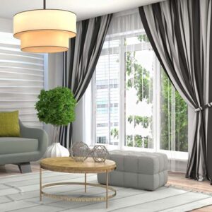
Minion Yellow can bring vibrancy and delight into any room, and it can be combined and used in a number of ways. Let’s look at Minion Yellow and the color combinations that work best.
- Match Minion Yellow with purple, to wind up with a perfect complementary color combination. Add the achromatic brown, and you have another look.
- In combining colors, try to keep a balance of 60%-30%-10% to make sure you don’t create competition of color. A soft look would be a brown room, with yellow as the 30% and purple as the 10% accent color. Or play with it to create the look and feel you want. A more dramatic look would be yellow, indigo, magenta, and black, creating a split complementary combination.
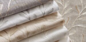
Choosing Colors
When choosing colors for a room, go with the colors you love. Trendy colors come and go, and unless you have tons of money, you should use what you love and not what you feel you need just because it’s stylish. When you use colors you don’t like, it tends to make you focus on areas you would otherwise avoid. Don’t use the colors in rooms where you want to feel your best. Remember, color forecasting is strictly to keep all manufacturers’ specifying the same colors to help the consumers coordinate and create a beautiful space. It is a guideline, and popular colors may vary in different regions.
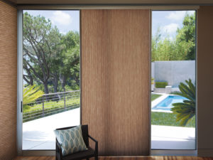
Using Forecasted Colors in San Francisco and Marin County
Blinds & Designs offers a full line of quality window treatments to homeowners and commercial clients throughout the San Francisco and Marin County areas, including Burlingame, Hillsborough, Atherton, and Los Altos. With an ongoing commitment to high quality products and exceptional service, we’ve been serving our communities for over 14 years. Stop by our showrooms in San Francisco or Tiburon to see a variety of motorization displays in our showroom or call 415-921-4212 for more information.